
The Lofree marketed as a ‘typewriter inspired keyboard’, and ‘the keyboard for the design conscious’. Online reviews however have been divided on it, so I feel it is appropriate for me to step into the fray, and give my own opinion on this unique keyboard.
Ever since the absurdly expensive QWERKY WRITER came out, there’s been a lot of interest in the Pinterest-able typewriter inspired keyboard market. So I feel it is time we got a real reviewer – someone well acquainted with writing on a typewriter, to review this keyboard.
*reclaimer (this isn’t a disclaimer, so what else could I call it?) I have not been provided this keyboard for free as a review item. I purchased this as part of the Indiegogo campaign, and waited several months for it to arrive – like everyone else.
The Lofree (version 1?)
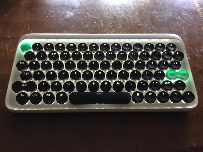
Gosh it’s pretty….. Ain’t she purdy?
The lowdown: It is a bluetooth keyboard that features backlit mechanical keys that is universally usable on multiple systems, but has been designed to be 100% feature compatible with the Apple bluetooth keyboard, with a set of top-row functions that are specifically designed for use with the MAC computer, and IOS devices – the iPad, iPhone & Apple TV.
This isn’t your usual Apple keyboard clone though. It is the only Mac keyboard that has a full set of modern keyboard features (mechanical, backlit, bluetooth), so it sits in a category of its own. That said, the unique design of the keys and the key layout, which the makers claim has been based on typewriter keyboards of old, additionally make it a unique device.
The keyboard also sits at a greater rake across the keys, with the keyboard tilted closer to the higher angle of a typewriter keyboard. Not quite the same angle, but definitely higher than most of the keyboards I have used in the last 10 years.
Mixed reviews
It is a keyboard that has had a fair amount of criticism. Typists that are used to contemporary keyboard designs have struggled with the somewhat unusual structure of the Lofree’s design. Common complaints have been that the design is so different that most keyboardists haven’t been able to use it for long stretches, and that the keys are too close together. All reviewers from major tech publications have claimed that it has taken weeks to adapt to using the Lofree, if they have been able to adapt at all – with most writing it off after about two weeks.
Damn pussies if you ask me. Yes, Sam Byford of ‘The Verge‘. I’m looking squarely at you.
The return key, right shift, and cursor keys that all are of a very non standard orientation have also copped some flack. And let’s not forget the re-orientating the number keys half key to the right, simply to accomodate the design layout.
Lofree’s typewriter credentials
To be frank, every keyboard in existence can claim to have been inspired by a typewriter. The simple QWERTY layout is a hangover from the heady up-strike typewriter days of the 1800’s. Typewriters may now be considered obsolete (boo to you that think that) but Sholes and Glidden’s reach into modern times remains undiminished with their keyboard layout sitting on millions of desks across the world to this day.
As I write this review, it is ‘international typewriter day’, celebrating Christopher Latham Sholes’s birthday.
The round keys are an essential part of this keyboard’s ‘typewriter inspiration’. This is kind of a bit odd. Typewriters since the 1950’s have adopted the squarer key layout for a reason. It was this adaption of a wider based key taking up a broader space on the keyboard that allowed for typists to hit the keys with far greater accuracy; especially novice typists.
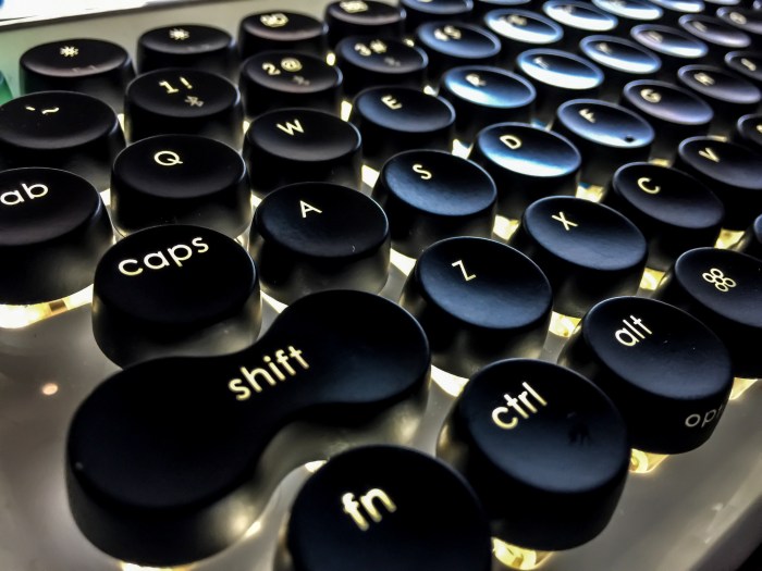
These rounded keys are quite concave, which allow my fingers to fall and ‘hook’ into and onto them quite easily. The shape is comfortable and feels much like the shape of the glass keys of the portable Royal Typewriter (often known as the Royal Deluxe) model made just before they moved to using ‘tombstone’ shaped keys.
Lofree claim that the mechanical switches chosen for use under the keys were picked because they sounded as close to a typewriter. For anyone that has actually used a typewriter, this should read “they have chosen the loudest switches they could find, because typewriters are loud”. Sadly, they sound about as close to a typewriter as a V8 car engine does.
But that’s not a bad thing. Frankly, I’m happy the keyboard sounds like a…. keyboard. A really loud one. It uses Gateron Blue switches, widely regarded as one of the loudest, if not THE loudest keyboard switches on the market. These are backlit beautifully, allowing the lettering on your keys to glow nicely, so hunt-and-peck keyboardists will have no problem finding the right keys on dark and stormy nights when their candles have blown out.
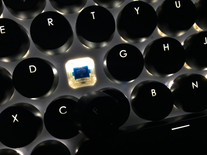
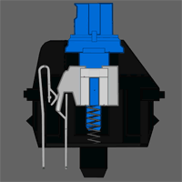
The backlighting and the mechanical switches are the strongest points of this keyboard. Blue switches (Both Gateron and Cherry makes) are designed specifically to give strong haptic feedback. They are complicated switches that feature a main post, a switch mechanism, and a secondary sliding piece that moves between them.
What this means is that you get very strong feedback under your fingers when the switch has actuated. This allows you to type rapidly without bottoming out your keys to get some kind of feedback that the key has been pressed.
As for the rake, or angle of the keyboard, it sits close to the angle of the Gossen Tippa and Groma Kolibri typewriters. So anyone used to typing on these machines, the setup of this keyboard will feel immediately familiar. For those used to the Apple Mac low-profile keyboard, or any current laptop keyboard for that matter, you’ll quickly find yourself crashing into keys as you find yourself having to learn to lift your fingers to type properly. a problem exacerbated by the longer throw of the mechanical keys.
Unlike all of the other keyboards on the market made for the Mac, this keyboard has a considerable heft to it, weighing much more than than Apple and Logitech’s offerings. It also has a good, solid pair of rubber feet which also appear very typewriter-like, which combined gives this keyboard far more stability on your desk than any small-factor keyboard (keyboards without keypads) currently on the market. Something very welcomed by heavy handed typists like me.
Whinge Whinge Whinge…
Some of the reviews I’ve read have been critical of the effort needed to actuate the keys on this keyboard, with reviewers finding themselves getting tired of it quickly. This is more of a modern phenomenon, as keyboards constructed like this aren’t actually new. Again, this is a result of adapting to the low quality, low feedback nature of contemporary keyboards that are very flat and use laptop-key like constructions.
The Lofree’s keyboard feel, along with the form factor of the keyboard, reminds me a lot of the Commodore 64 keyboard, and the first generation of Amiga computer keyboards. Mechanical levers originally were used in the IBM’s Selectric typewriter, which several generations later evolved into the venerated IBM “M” Keyboard, with its own mechanical switch design.
Just for reference, this keyboard doesn’t feel like an M keyboard.
For those in the typosphere, you’ll have heard these complaints about fatigue before. The longer key throw of typewriters, and the need to lift your fingers higher to hit the keys means that most people’s fingers are very much out of shape for writing on such keyboards. Frequent typewriter users however, will find the keys on this keyboard to have far less of a throw than they are used to, and like me, will probably bash the key to the base of the keyboard with very little effort.
The rake of the keyboard also lends itself to better typing and keyboarding skills than most people have these days. Typewriter desks were positioned lower than regular tables and desks for a reason; typists needed to have their hands positioned above the keyboard to strike down, with their hands never resting on the able. The lower arm strength and finger strength of modern typists that are used to typing on keyboards that sit just below their chests where they rest their wrists on a table, will initially struggle with this keyboard.
The transition time for me to get used to this was about…. 0 minutes. I have no problems with mechanical keyboards, and I immediately appreciated the haptic feedback provided.
The key positioning however is another thing.
Most contemporary keyboards have their letters offer ad an angle to each other that positions them nicely for touch typing. Think of yourself being the centre of the keyboard. Look at the keyboard you sit at now, and it will appear that columns of keys move away from you at an angle, as though they radiate from you.
The Lofree keyboard however has a slightly steeper angle across the keyboard for the columns of keys. Meaning at first the keys will be slightly off from centre from where you expect them to be when you type. Again, this sits closer to the layout of a typewriter than modern keyboards do.

The keys were laid out this way purely to keep them looking symmetrical across the keyboard, placing form above function.
This doesn’t kill the keyboard, but it does add to the transition time. Users will find themselves miss-fingering occasionally at the top row (the row above the home row). But personally I never had any issues the keys below the home row.
Interestingly, this design has allowed for the keys in each row to sit closer to each other. While I’ve read a lot of complaints about people saying that this makes the keyboard feel cramped, it actually makes the keyboard slightly easier to type on for those with less keyboard experience. At the moment people are too used to not having to lift their fingers to reach the keys, and as such are bumping against the keys they are trying to reach. Adjust your height properly, and you find you don’t need to reach quite as far forward to hit a key. Just higher than you are currently used to.
Experienced typewriter typists will have a distinct advantage here. Where as some touch keyboardist have struggled for weeks (hunt-and-peckers need not apply) touch typists used to lifting fingers higher will rock it in with a much quicker with the transition time. It isn’t any issue about being cramped, as I myself has big dumb hands, and I don’t have an issue with this being cramped. Picking up the tiny screws of typewriters I’m trying to repair however…
Transition time for me: 20 minutes.
I’ve heard complaints about the return key, and right shift key. To be frank, I pretty much established a long time ago that I rarely use the right shift key. So I really have noticed no issues. The return key feels fine to me too, with no problems to report.
The cursors? I haven’t had problems with the offset layout either. I use cursors a lot at work where I have large extended keyboard to fly around large documents, but rarely at home in the same way, so the more casual usage on my home computer has never seen me have a problem with the layout.
That said, I can see it being a problem for gamers. But frankly if you’re using this keyboard, you’re unlikely to be a gamer. Theres keyboards made specifically for that purpose which you are much better off with.
Transition time for me: 0 minutes
The biggest problem with this keyboard however is the numbers row. Even I haven’t been able to totally get my head around it in two weeks. It is offset to the right by at least half a key in length. At first I kept typing “~” instead of “!” That lasted about a day I also frequently use the “-” key when writing, where the offset also messes with me.
I don’t have any issues with the numbers as I have become so used to using a numerical keypad at work, that I have to hunt-and-peck with the top row of numbers whenever I’m at home and on the Apple keyboard anyway. I just find it an occasional inconvenience. Something that is a slight annoyance on this keyboard, that would be a fatal flaw on a typewriter.
The beauty of the design.
The photos online of this keyboard never did it justice. It isn’t until you have it on your desk that you realise how incredibly striking it is. It is curvy and edgy, and takes its design cues from both retro structures and modern architecture – think the curvy plastics of the last of Remington typewriter’s portable machines, with the modern sharp yet organic look of the high-end of modern design and architecture. It looks suitably advanced and retro at the same time. It is simply…. beautiful.
Except….

The photo above depicts the switch labelling at right the side of the keyboard. It looks awful. I mean… really awful. And it isn’t clear either. See that bluetooth switch? It looks like it has 2 modes. It in fact has 3. The regular Bluetooth mode, the ‘On’ mode – where you can plug the keyboard into the supplied mini USB cable which you use for charging, and use it as a wired keyboard. And finally, a complete ‘off’ mode.
The ‘the quality of the ‘on’ switch is so poor that I couldn’t feel the middle switch mode when I used it, and thus wrote an email to the company asking why wired mode wasn’t working, before I found the mode accidentally when I slightly knocked the switch. For a keyboard that is so focused on providing great haptics with those mechanical keys, the lack of feedback in this switch is astounding.
The instructions for the bluetooth are just as clumsy and poorly thought out. They are repeated in two places inside the box, but both sets are confusing, making it difficult to understand what you need to do to pair it to your bluetooth devices. I also emailed them about how perform this too, and it wasn’t until I got a response from a person clearly tired of answering the same question again and again, that I understood the bad nuances of the the instructions that allowed me to achieve this.
Thank fudge these are things I only need to look at occasionally, and really don’t make a difference to the function of the keyboard.
Conclusion
My bold title ‘The only LOFREE keyboard review that matters” may sound a bit pretentious, but I feel that it is important that an experienced typewriter typist reviews this keyboard and looks much closer at it, than a slap-dash hack that is used to bashing at a flat laptop keyboard can.
As for a daily driver keyboard, ever since I attached this to my Mac, I haven’t returned once to my Apple keyboard. I like it. I like it a lot, and I’m glad to have bought it sight-untested on Kickstarter. There’s certainly some improvements that could be made to this keyboard, but I don’t think it is anywhere near as bad as some media outlets have made it out to be.
I touch type on this machine proficiently, and I still can move between other keyboards without any adjustment problems. I agree that there’s a transition phase to adapting to using this keyboard, but I frankly feel it is worth the effort, and it isn’t as close to being as overwhelming as some reviewers have made it out to be.
It uses Mechanical keys like the QWERKY writer, but doesn’t have the retro-looking chrome rings. This is a plus for typewriter users moving across to this keyboard, as it doesn’t try to hold fully the same pretence that it is the same thing, instead it meets you half-way. But with bluetooth and backlighting, while being less than half the price of the QWERKY writer, along with a design that fits nicely both modern and retro camps, it leaves the QWERKY writer looking like a very expensive toy. This keyboard is much more orientated to a serious user, and is a legitimate competitor to the existing Apple bluetooth keyboard for use on Macs and iPads for those looking for different features in a keyboard.
Now if only the makers of the upcoming Penna keyboard would send me a unit to review… Hey guys… you there?


Thanks for the effort. As soon as I have my Penna, I will also do a typewriter-related review. 😀
LikeLiked by 1 person
Now you’ve gotten me interested, Scott!
LikeLike
Very cool review! I myself will never own one, because I tend to type on whatever they put in front of me. I will however, pass this info on to my son, who flies on modern keyboards. ~TH~
LikeLike